Cal Poly ASI Access
Project Length: 10 weeks
Roles: UX/UI Designer, User Researcher
Tools: Figma, Google Forms
Overview
As part of a three-person design team, I redesigned Cal Poly’s ASI Access app — the platform students use to access gym facilities and view campus event information. Our goal was to improve usability, simplify gym access, and make event information more discoverable.
Challenge
Students reported frequent frustration with the app’s barcode login process and limited in-app functionality. Many features redirected to external websites, resulting in a fragmented experience and low engagement.
Research and Insights
We surveyed 40 students to identify key pain points. Every respondent emphasized the need for quick barcode access, with over half expressing dissatisfaction with the current loading speed and login reliability. Additionally, 75% of respondents wanted a more intuitive way to learn about upcoming ASI events directly within the app.
Solution
I helped redesign the app flow to prioritize immediate barcode visibility upon launch and improve navigation between gym access and event discovery. We streamlined the interface, reduced dependency on external links, and introduced a dedicated events hub with filters for activity type and date.
Impact
The redesign proposed a faster, more reliable check-in process and an engaging, student-centered way to explore ASI offerings. Usability testing suggested improved satisfaction with navigation clarity and barcode accessibility.
Key Learnings
This project strengthened my skills in designing for institutional systems with limited technical flexibility and taught me the importance of balancing utility and engagement in mobile design.
Design Process
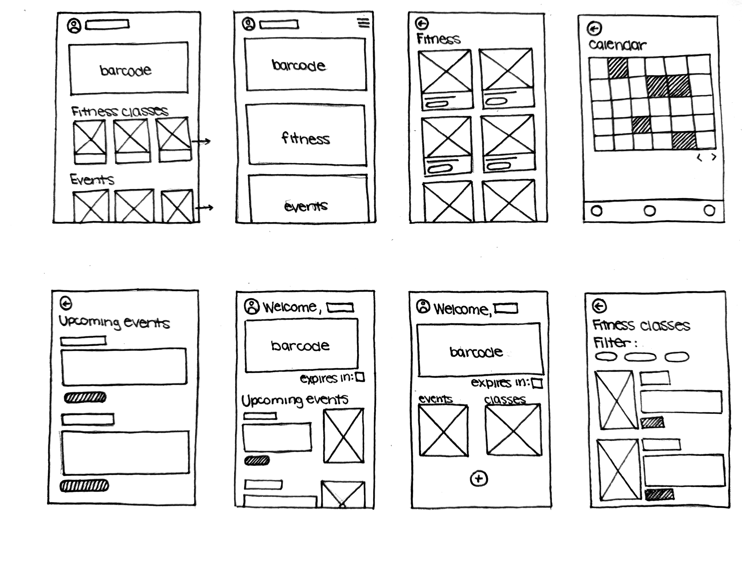
After reviewing the existing app and conducting an informal heuristic evaluation, we completed a Crazy 8 exercise. During this process, I explored design solutions across multiple tabs to expand the range of ideas and potential approaches.
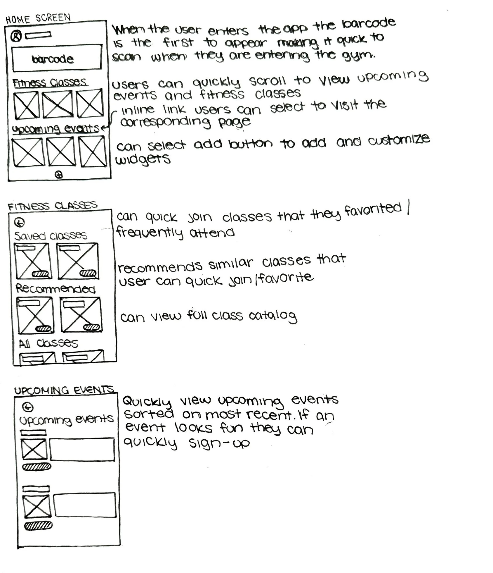
After reviewing the Crazy 8 sketches as a team, we used dot voting to select the strongest solutions. Based on this feedback, I developed three screens into solution sketches to further refine the ideas and identify issues that may have been overlooked during rapid ideation.
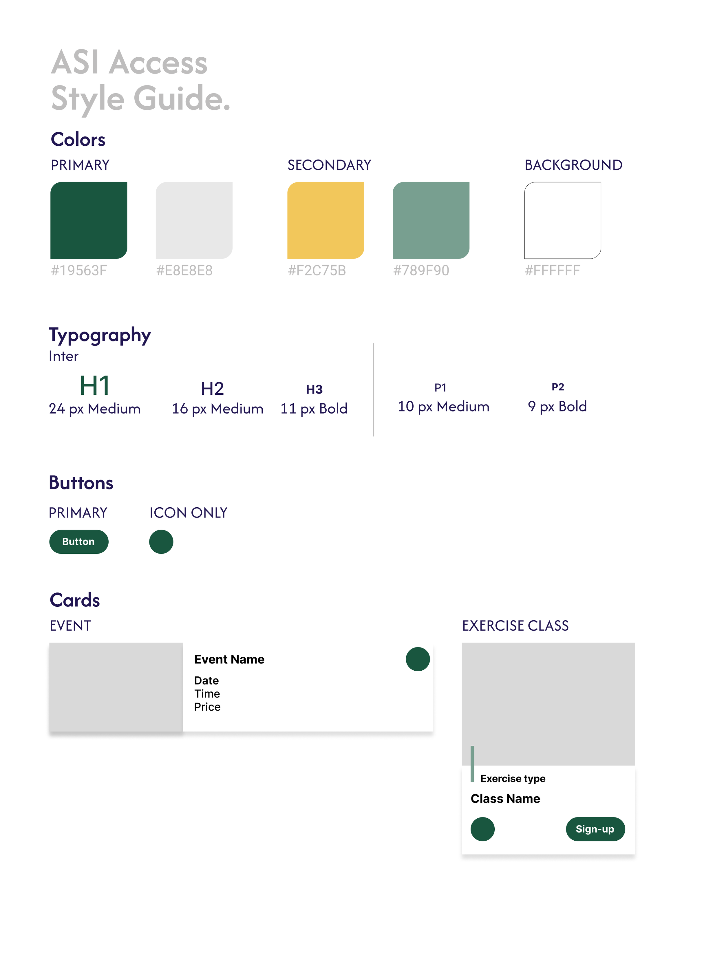
The ASI Access app visuals aligned with Cal Poly's brand identity. I referenced existing Cal Poly websites and the ASI Access app to identify consistent colors and styles, then created a style guide to ensure the team used the same color palette, typography, and card components throughout the design.
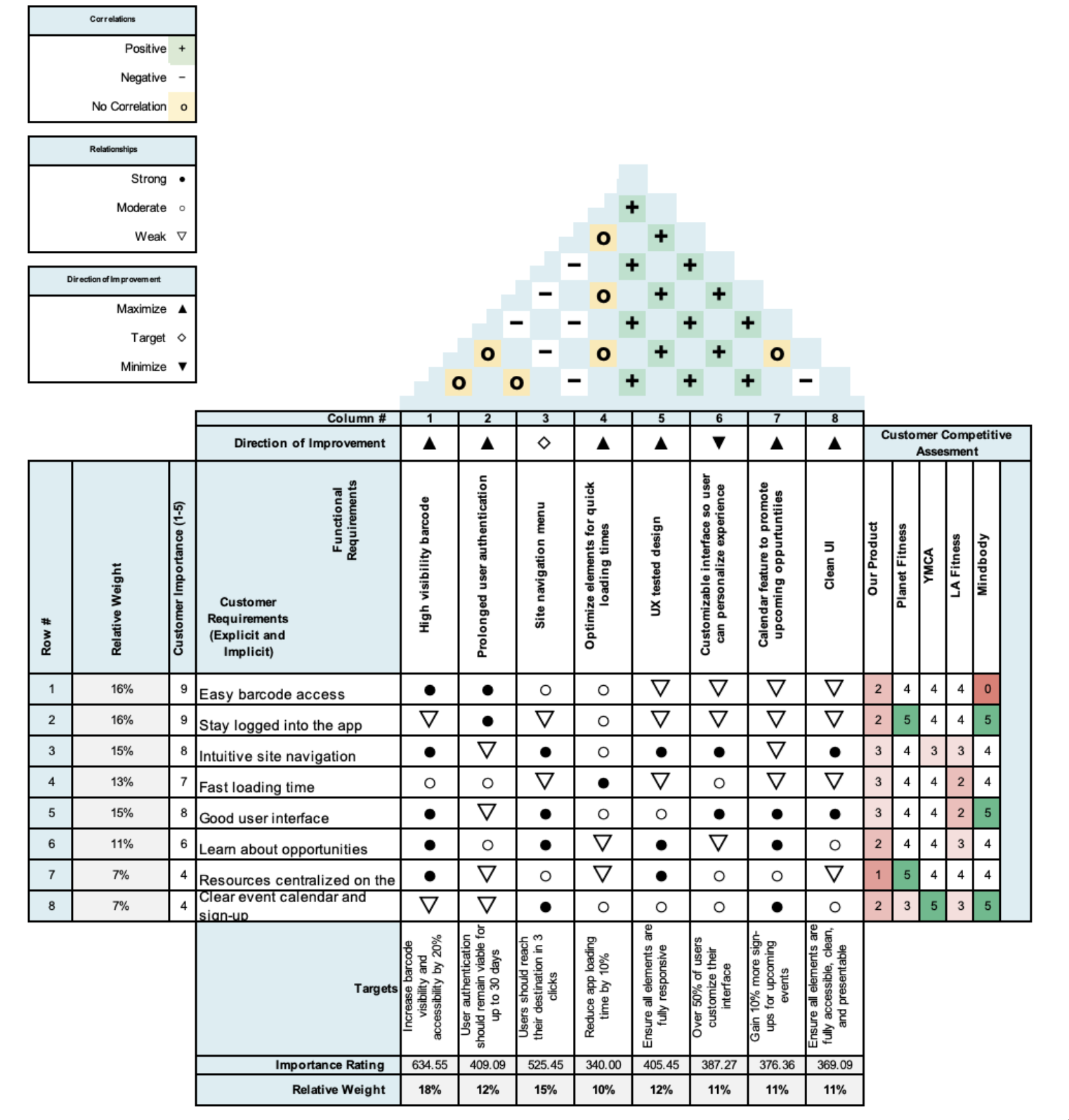
I used a House of Quality to map user requirements against competitors, prioritize features, and identify opportunities to differentiate our product while addressing critical user needs.
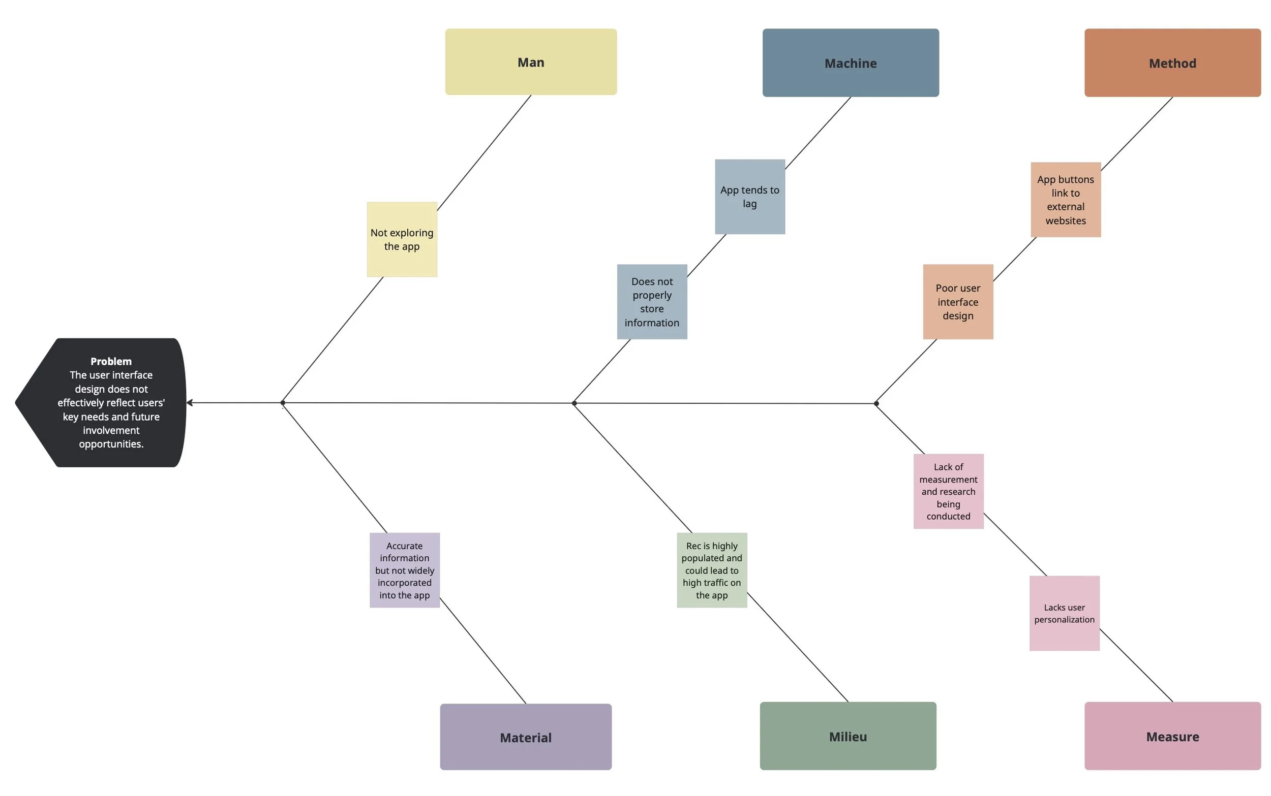
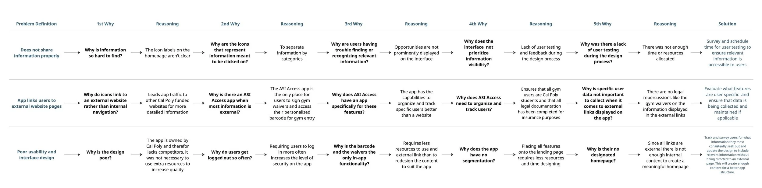
I used a Fishbone diagram to uncover why the UI failed to highlight users' key needs and involvement opportunities, helping the team identify root causes and design more effective solutions.
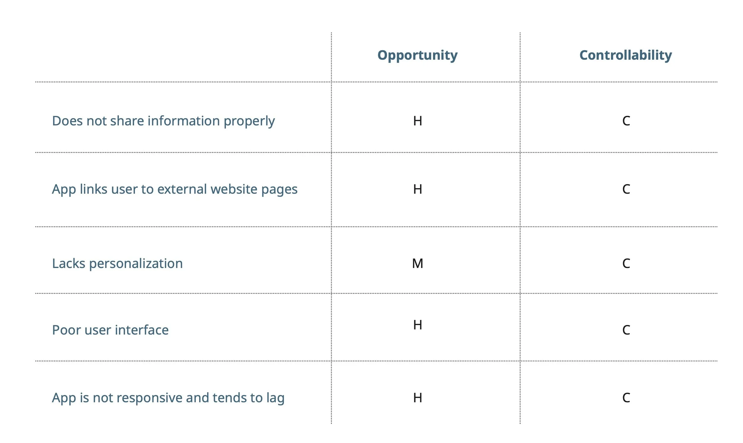
Using the pain points identified in the Fishbone diagram, we ranked each by opportunity for impact and level of control. Most issues scored high in impact, as they fundamentally affected how users perceived and interacted with the website. Their severity helped explain why users reported dissatisfaction with the app, while the control ranking guided which problems we could realistically address.